
Snow Mountain Ranch Aspens. 21 x 21. Oil on linen panel.
All of my life I've had a love affair with the Rocky Mountains, and this last Christmas was no exception. Our family made the trek to enjoy sleigh rides, skiing and time together. Several mornings, I stayed back in the cabin to paint the views out the windows. The snow hushed all sounds; the tiny drifting flakes lightened the dark mountains, and the edges of the aspen trees spread like delicate feathers into the sky. At first the scene seemed totally grey and taupe, yet as I looked at for a while, I kept on seeing more and more color.
The mountain behind the trees was continually changing because of the aerial perspective created by the snow, and the individual flakes were continually moving. I painted the scene four times with different color schemes--initially with the grey and taupe, and then later, pushing and exagerating the color to make the scene have the interest that I felt. The sky was not actually pink in reality, but I painted it just as light (in terms of a gray scale) as the soft muted blue that it was. The painting is not a photographic representation of the scene, but instead a representation of how I saw it. I have tried to use my brushes to capture the vibrant sense of wonder I felt that morning about the snowy aspens and distant mountain.
The tool I used to make the scene feel vibrant was color. Do you remember learning about the color wheel as a child? Perhaps in connection with the smell of a new box of 64 brilliant crayons? Each of the primary colors--red, yellow and blue--has a complement, which is the mixture of the other two. So we have red with its complement, green, which is mixture of yellow and blue, and so forth. One of the ways an artist creates interest is to use a complementary color scheme. If you look at the painting above, do you see the yellow and purple? They are muted, but they are there. If you are interested in more about the color wheel, colormattters.com has the basics.
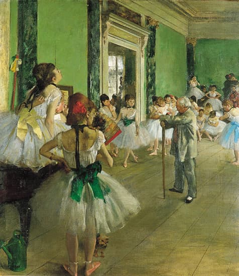
Also look at Degas' painting, "La Classe de Danse" at the Musée d'Orsay in Paris. You will clearly see the primary colors displayed and an example of complementary colors: the dancer's bright red hair ornament and the green walls. It is highly unlikely that the dancers just happened to have accessories in the studio that were red, yellow, green and blue, and that they were arranged in difficult poses just so. One of the things that makes Degas a master is his ability to tweak reality and make it exciting for us.
A big thank you goes to each of you who has shared observations and ideas with me, and thanks for allowing me to share mine.
-Mallory